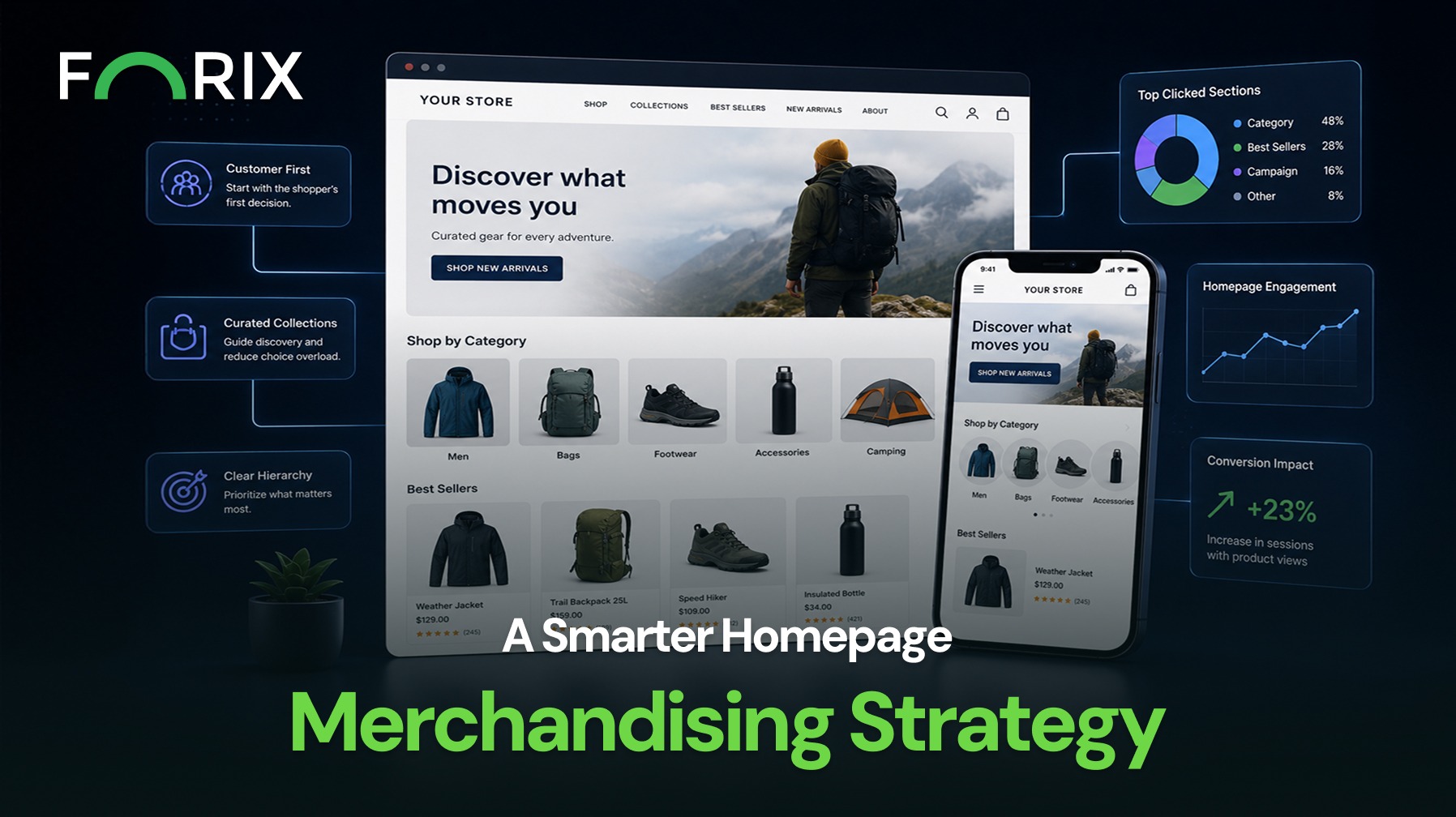
A Shopify homepage should do more than introduce the brand. It should help shoppers understand what the store sells, recognize where to begin, and move quickly toward relevant products. That requires a merchandising strategy built around customer intent rather than a collection of disconnected promotional blocks.
Many homepages become crowded because every campaign, category, product launch, and brand message competes for attention. The result is often a long page with several banners but no clear shopping path. A smarter approach gives each section a defined role and organizes the page around the decisions shoppers need to make.
Explore how Forix’s Design and Strategy services help Shopify retailers create homepage merchandising systems that improve product discovery, clarify priorities, and support stronger conversion paths.
Start With the Shopper’s First Decision
The homepage should answer one practical question immediately: where should the shopper go next?
That destination may be a major category, a featured collection, a best-selling product group, or a seasonal offer. The right choice depends on the store’s catalog and the intent of its audience. A retailer with a broad catalog may lead with category paths. A focused brand may guide shoppers toward a small number of signature products.
The hero section should support that first decision with a clear message, relevant visual, and specific call to action. Generic buttons such as “Learn More” create less direction than labels such as “Shop Men’s Running Shoes” or “Explore New Arrivals.”
Build a Clear Merchandising Hierarchy
Homepage sections should not all receive equal visual weight. The order and size of each block should reflect its importance to the customer journey and the business.
A practical hierarchy may include:
A primary campaign or category path.
High-priority collections or product groups.
Best sellers, new arrivals, or featured products.
Trust-building content such as reviews or service benefits.
Educational content, brand storytelling, or secondary offers.
This hierarchy keeps the page focused. It also prevents secondary content from interrupting the main shopping path.
Use Collections to Reduce Choice Overload
Displaying too many individual products can make the homepage harder to scan. Curated collections often provide a better starting point because they group products around a recognizable need, use case, audience, or theme.
For example, a retailer could organize merchandise by activity, product type, room, season, price range, or shopper profile. Collection labels should be clear enough that visitors understand what they will find before clicking.
Shopify gives retailers flexibility to feature dynamic collections, but automation should not replace merchandising judgment. Product rules, inventory, imagery, pricing, and relevance still need regular review.
Balance Commercial Goals With Shopper Relevance
A homepage can support revenue priorities without feeling like a wall of promotions. The strongest merchandising decisions connect business goals with what shoppers are likely to find useful.
High-margin products, excess inventory, launches, and campaign offers may deserve visibility, but placement should still match visitor intent. A promotion that interrupts product discovery can reduce engagement even when the offer itself is attractive.
Retailers should consider which products deserve attention, why they matter now, and which shopper segment will respond to them.
Keep Product Cards Consistent and Actionable
When products appear on the homepage, their cards should provide enough information to support comparison. Imagery, product names, pricing, ratings, promotional labels, and variant information should follow a consistent pattern.
Quick-add functionality can reduce steps for simple products. For configurable or higher-consideration products, a clear link to the product page may be more appropriate. The interaction should match the amount of information shoppers need before purchasing.
Measure How Shoppers Use the Homepage
Homepage merchandising should evolve based on performance. Retailers can review click-through rates, collection engagement, product-card interactions, scroll depth, and downstream conversion behavior.
The goal is not to optimize every section independently. It is to understand whether the page helps more shoppers reach relevant products and continue through the purchase journey.
Conclusion
A smarter Shopify homepage merchandising strategy creates direction. It prioritizes the first shopping decision, establishes a clear content hierarchy, uses collections purposefully, and balances commercial priorities with customer relevance.
Forix helps Shopify retailers evaluate homepage performance and design merchandising systems that make products easier to discover, campaigns easier to understand, and shopping journeys easier to continue overall.
Homepage merchandising is the process of selecting, organizing, and presenting products, collections, promotions, and content on the homepage to guide shoppers toward relevant shopping paths.
What should a Shopify homepage feature first?
The first section should feature the most relevant starting point for the store’s audience. This may be a primary category, featured collection, campaign, new product launch, or best-selling product group.
How many products should appear on a homepage?
There is no universal number. Retailers should show enough products to support discovery without overwhelming shoppers. Curated collections may be more effective than displaying many individual products.
How should retailers choose homepage collections?
Collections should reflect common shopper needs, high-priority categories, current campaigns, product use cases, customer segments, or commercially important merchandise.
How can Shopify retailers measure homepage merchandising performance?
Retailers can evaluate homepage click-through rates, collection engagement, product-card interactions, scroll behavior, add-to-cart activity, and downstream conversion performance.
From flat sales to explosive sales growth - here's what happens when you partner with Forix
Partnering with Forix was hands down the best decision I’ve made for my store. The
redesign completely
transformed my site — it looks like a million dollars, yet I paid only a fraction of
what I expected.
Even better, sales started climbing almost immediately. Their process was simple,
transparent, and
focused on results. I only wish I had done it sooner.
Sarah Mitchell,Owner
“The free website report from Forix opened our eyes to issues we didn’t even know were costing us sales. The recommendations were clear, actionable, and backed by data. After implementing just a few of their suggestions, we saw a noticeable lift in conversions within weeks. Forix didn’t just give us a report—they gave us a roadmap to growth.”
Lena Hoffman, Director of eCommerce
“The redesign was exactly what my business needed. Clean, mobile-friendly, and conversion-focused. Sales are up 35% since launch.”
Ethan Carter, Founder
“Forix made our Magento to Shopify migration completely stress-free. Every product, customer record, and integration was moved accurately, and the new store’s design is sleek and user-friendly. Our team can now focus on growing sales instead of worrying about technical issues.”
Emily Rivera, Head of Digital Operations
198%
Conversion increase
32%
Transaction increase
30%
Time on site increase
28%
Conversion increase
92%
Revenue increase
87%
Engagement increase
Ready to See the Difference?
Your next big sales boost could start with our free website report. Let us show you the
untapped
potential in your store.
Complete the form below and our team will reach out to get started.
Thank you!
We’ve received your request for a free website report. Our team will be in touch shortly to gather a few details so we can begin your site analysis.
Click Here To
Get My Free Website Report Now
Claim Your FREE Webpage Design and Sell More ASAP
Complete the form below and our team will reach out to get started.
Thank you!
We’ve received your request for a free webpage design. Our team will be in touch shortly to gather a few details so we can begin your page redesign.
Click Here To
Get My Free Webpage Design Now
Claim Your FREE Migration Assessment and Sell More ASAP
Complete the form below and our team will reach out to get started.
Thank you!
We’ve received your request for a free Magento-to-Shopify migration assessment. Our team will be in touch shortly to gather a few details so we can begin building your comprehensive migration plan.
Click Here To
Get My Free Migration Assessment Now
Claim Your FREE Site Report and Sell More ASAP (a $2,000 value).
Complete the form below and our team will reach out to get started.
Thank you!
We’ve received your request for a free website report. Our team will be in touch shortly to gather a few details so we can begin your site analysis.