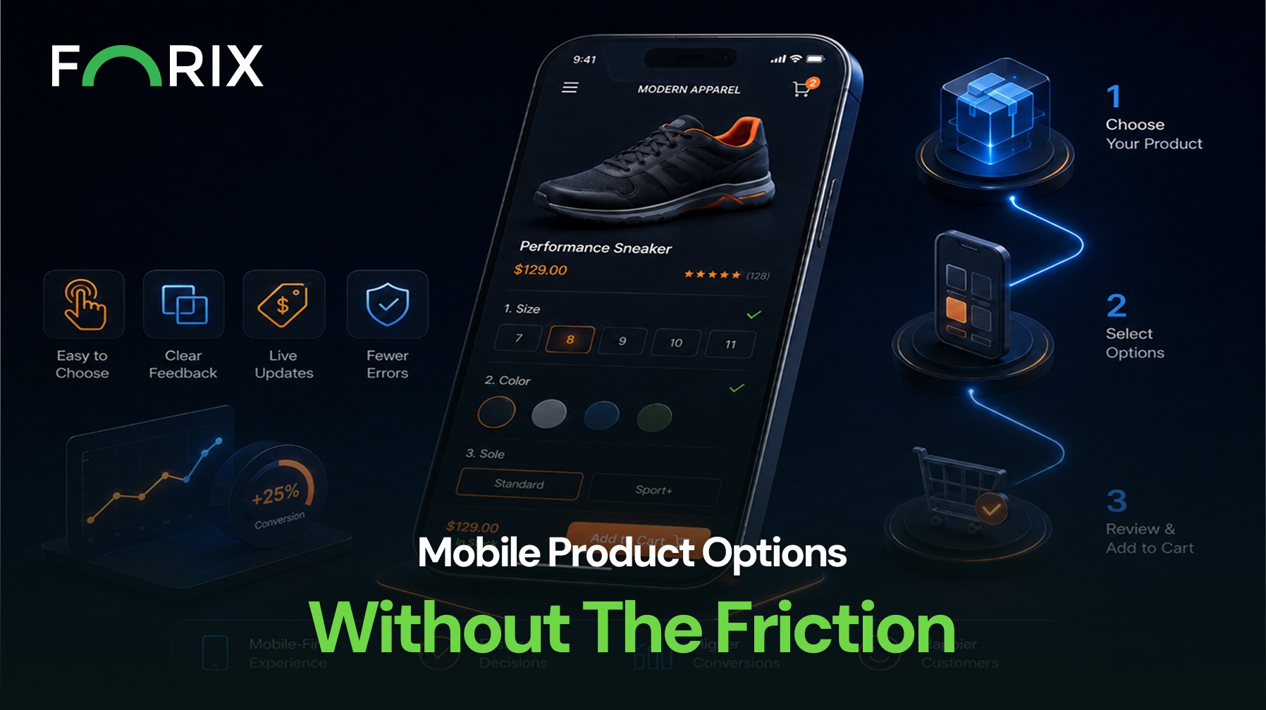
Choosing product options should feel simple. Yet crowded swatches, unclear labels, and complex configuration rules can make mobile shopping difficult on Magento and Adobe Commerce stores.
A better mobile experience clearly shows available options, selected choices, and the next step toward adding the product to cart.
Explore how Forix’s Design and Strategy services help Magento and Adobe Commerce brands simplify product configuration, reduce mobile friction, and create clearer paths to purchase.
Why Mobile Product Options Create Friction
Desktop product pages have more space for labels, swatches, specifications, and purchase controls. Mobile pages must fit the same information into a narrow viewport while remaining easy to scan and operate by touch.
Problems appear when options wrap unpredictably, selected states are too subtle, unavailable combinations are not explained, or the page shifts after each choice. Shoppers may also lose sight of the price, stock status, or Add to Cart button.
Make the Selection Order Easy to Understand
When a product requires multiple choices, the order should reflect how shoppers naturally evaluate it. A clothing product may start with color and size. A technical product may begin with model compatibility before presenting finishes or accessories.
Use clear labels above each control and show the current selection in readable text. Avoid relying on color alone. When later options depend on an earlier selection, explain that relationship instead of simply disabling controls.
For complex configurations, guide shoppers through a logical sequence:
Choose the primary product type or model.
Select required compatibility or sizing options.
Present available finishes, colors, or add-ons.
Confirm the final configuration, price, and availability.
Design Controls for Touch
Mobile option controls should be easy to tap without accidental selections. Swatches, buttons, checkboxes, and dropdown triggers need adequate spacing and clear selected, unavailable, and error states.
Long dropdowns can be difficult to scan. A searchable list or grouped layout may be easier to use. Swatches work when visual differences matter, but every swatch should include a readable label.
After a selection, the page should update the image, price, SKU, availability, or other relevant details.
Keep Purchase Information Connected to Each Choice
A product selection can affect price, inventory, delivery timing, imagery, and purchase eligibility. These changes should remain visible near the option controls or purchase area.
A sticky purchase area can keep the price, selected configuration, quantity, and Add to Cart action accessible. Error messages should be specific. Instead of “Select required options,” identify the missing field. If a combination is unavailable, explain which selection caused the conflict and provide a direct way to revise it.
Use Progressive Disclosure for Complex Products
Not every option needs to appear at once. Progressive disclosure can reduce visual overload by showing secondary choices only after the shopper completes the primary decision.
Accessory choices may appear after the main configuration is valid. Additional specifications can remain inside expandable sections. Optional services can be separated from required selections so shoppers understand what is necessary to purchase.
Test the Complete Mobile Journey
Test product-option design as a full mobile journey. Review common devices and verify how the experience behaves with long labels, unavailable variants, validation errors, price changes, slow connections, and large option sets.
Analytics can identify where shoppers stop interacting, repeatedly change selections, or fail to add configured products to cart. Usability testing can reveal whether the problem comes from unclear language, control design, selection logic, or missing feedback.
Conclusion
Mobile product options should build confidence, not make a product feel harder to buy. Clear selection order, touch-friendly controls, visible pricing and availability, useful errors, and progressive disclosure can reduce friction across Magento product pages.
Forix helps Magento and Adobe Commerce retailers evaluate complex product experiences and design practical improvements that support clearer decisions, stronger usability, and more effective conversion paths.
Mobile screens provide less space for swatches, dropdowns, specifications, pricing, and purchase controls. When these elements are crowded or unclear, shoppers may struggle to complete the required selections.
How should Magento stores organize multiple product options?
Options should follow the shopper’s natural decision order. Primary choices, such as product type or compatibility, should appear before secondary choices such as color, finish, accessories, or optional services.
Are swatches or dropdowns better for mobile product options?
The appropriate control depends on the option. Swatches work well for visual differences, while searchable or grouped lists may work better for long or technical option sets. Every control should include a readable label.
What information should update when shoppers select an option?
The product image, price, SKU, availability, delivery information, and Add to Cart eligibility should update whenever they are affected by the selected configuration.
How can Magento retailers identify product-option friction?
Retailers can review product-page analytics, option interactions, add-to-cart performance, configuration errors, and usability-testing results to identify where shoppers become confused or abandon the selection process.
From flat sales to explosive sales growth - here's what happens when you partner with Forix
Partnering with Forix was hands down the best decision I’ve made for my store. The
redesign completely
transformed my site — it looks like a million dollars, yet I paid only a fraction of
what I expected.
Even better, sales started climbing almost immediately. Their process was simple,
transparent, and
focused on results. I only wish I had done it sooner.
Sarah Mitchell,Owner
“The free website report from Forix opened our eyes to issues we didn’t even know were costing us sales. The recommendations were clear, actionable, and backed by data. After implementing just a few of their suggestions, we saw a noticeable lift in conversions within weeks. Forix didn’t just give us a report—they gave us a roadmap to growth.”
Lena Hoffman, Director of eCommerce
“The redesign was exactly what my business needed. Clean, mobile-friendly, and conversion-focused. Sales are up 35% since launch.”
Ethan Carter, Founder
“Forix made our Magento to Shopify migration completely stress-free. Every product, customer record, and integration was moved accurately, and the new store’s design is sleek and user-friendly. Our team can now focus on growing sales instead of worrying about technical issues.”
Emily Rivera, Head of Digital Operations
198%
Conversion increase
32%
Transaction increase
30%
Time on site increase
28%
Conversion increase
92%
Revenue increase
87%
Engagement increase
Ready to See the Difference?
Your next big sales boost could start with our free website report. Let us show you the
untapped
potential in your store.
Complete the form below and our team will reach out to get started.
Thank you!
We’ve received your request for a free website report. Our team will be in touch shortly to gather a few details so we can begin your site analysis.
Click Here To
Get My Free Website Report Now
Claim Your FREE Webpage Design and Sell More ASAP
Complete the form below and our team will reach out to get started.
Thank you!
We’ve received your request for a free webpage design. Our team will be in touch shortly to gather a few details so we can begin your page redesign.
Click Here To
Get My Free Webpage Design Now
Claim Your FREE Migration Assessment and Sell More ASAP
Complete the form below and our team will reach out to get started.
Thank you!
We’ve received your request for a free Magento-to-Shopify migration assessment. Our team will be in touch shortly to gather a few details so we can begin building your comprehensive migration plan.
Click Here To
Get My Free Migration Assessment Now
Claim Your FREE Site Report and Sell More ASAP (a $2,000 value).
Complete the form below and our team will reach out to get started.
Thank you!
We’ve received your request for a free website report. Our team will be in touch shortly to gather a few details so we can begin your site analysis.