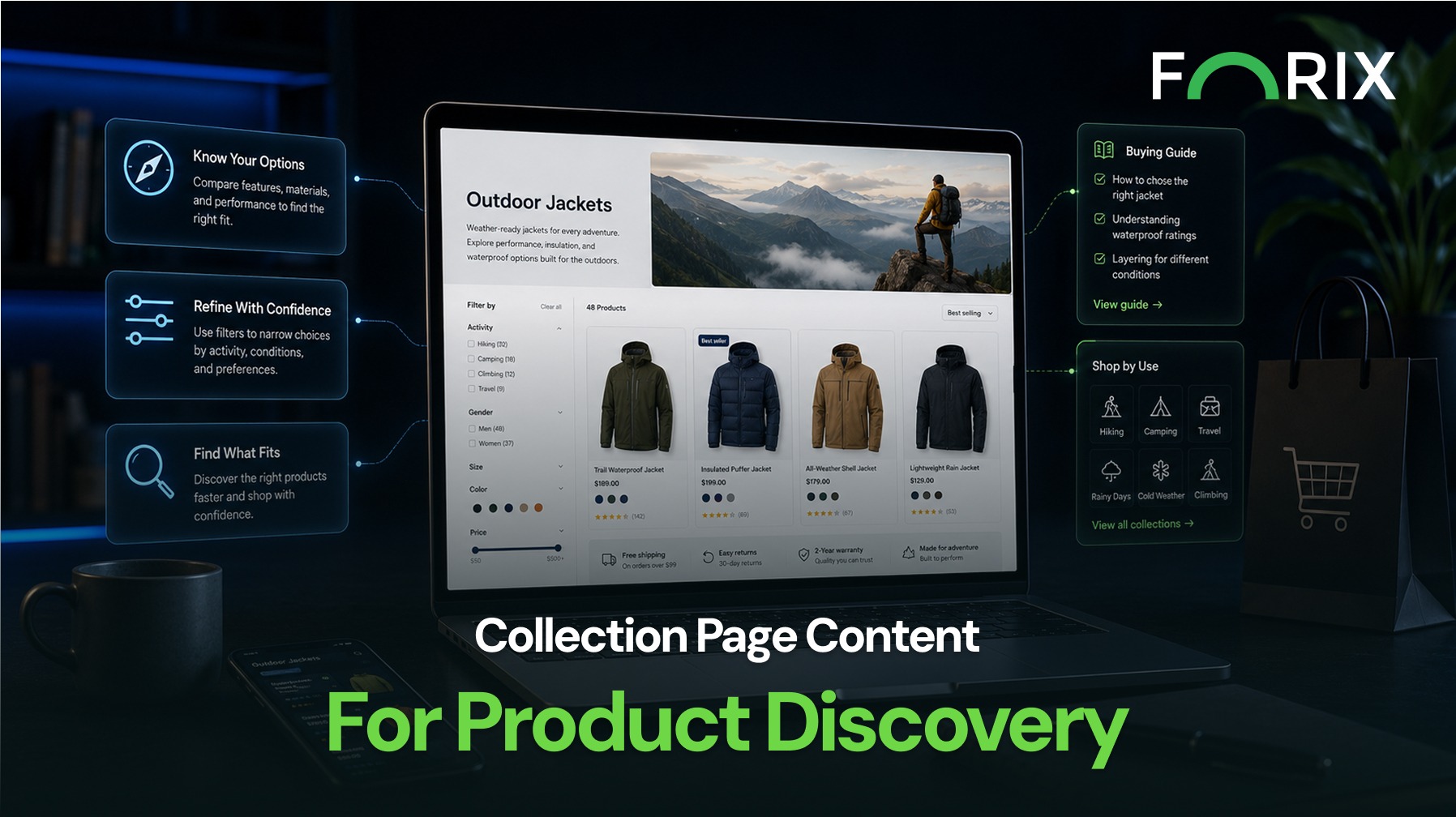
Shopify collection pages connect broad navigation with individual product decisions. They help shoppers narrow a catalog, compare options, and decide which products deserve closer attention.
When these pages contain only a product grid, shoppers must interpret the category without guidance. They may not understand product differences, which filters matter, or where to begin. Well-structured collection content can reduce that uncertainty while keeping products at the center of the experience.
Collection pages attract shoppers with different levels of product knowledge. Some know what they need. Others are comparing materials, styles, uses, prices, or features.
Useful content gives both groups enough context to move forward. It can explain what the collection includes, highlight meaningful differences, and direct shoppers toward relevant products without forcing them to open every product page.
The goal is to place concise guidance where it helps shoppers make the next decision.
Start With a Clear Collection Introduction
The opening copy should quickly answer three questions:
What products are included?
Who is the collection designed for?
What should shoppers consider before choosing?
A short introduction can establish the collection’s purpose and clarify terminology. It should help shoppers while keeping the first product rows visible.
For example, a footwear collection might explain whether products are intended for daily wear, technical use, or specific conditions. A furniture collection might clarify material or assembly differences. This makes the product grid easier to interpret.
Use Buying Guidance Near Relevant Products
Not every explanation belongs at the top. Shopify retailers can place short guidance blocks between product groups or near filters, featured items, and subcollections.
These blocks can explain:
Differences between product types.
How to choose a size, material, or configuration.
Which products suit a particular use case.
When to compare related collections.
Where to find compatibility information.
Placement matters. Guidance is most useful when it appears close to the decision it supports. A sizing note near size filters is more actionable than the same information at the bottom.
Connect Content With Filters and Subcollections
Collection content should reflect how shoppers refine products. If customers commonly choose by material, use, compatibility, or price, those dimensions should appear consistently in headings, filter labels, and supporting copy.
Subcollection links can also reduce effort. Instead of asking shoppers to filter a broad collection repeatedly, retailers can provide paths into narrower groups such as beginner products, premium options, replacement parts, or products for a specific application.
These links should use descriptive labels. “Shop outdoor seating” is more useful than “View more” because it tells shoppers where the link leads.
Keep Product Cards as the Primary Focus
Content should support the product grid, not compete with it. Long paragraphs, oversized banners, and repeated promotions can push products too far down the page.
Strong collection page design uses concise copy, scannable headings, and intentional spacing. Product cards should remain easy to compare, with clear imagery, pricing, variants, ratings, and availability.
Retailers should also review mobile layouts. Content that feels balanced on desktop may become an obstacle when stacked above products on a smaller screen. Short introductions, collapsible guidance, and well-placed links can preserve clarity without excessive scrolling.
Measure Whether Content Improves Discovery
Collection content should be evaluated through shopper behavior. Useful signals include product click-through rate, filter use, collection exits, add-to-cart activity, and movement into subcollections.
Teams should compare these signals before and after changes. Site-search queries and customer-service questions can also reveal information shoppers cannot find.
If shoppers leave without opening products, the collection may need clearer segmentation or stronger product-card information. If they use guidance but do not add items to cart, the next issue may exist on the product page.
Conclusion
Collection page content can make a Shopify catalog easier to understand without overwhelming shoppers. Clear introductions, relevant buying guidance, descriptive subcollection paths, and focused product cards help customers move from broad interest to specific products with less effort.
Forix helps Shopify retailers use customer behavior, UX strategy, and content structure to improve product discovery. A stronger collection page does more than display inventory. It gives shoppers a clearer path toward products that fit their needs.
How much content should a Shopify collection page include?
Collection page content should be long enough to explain the category and support product selection, but concise enough to keep products visible. A short introduction and strategically placed guidance blocks are often more useful than one long section.
Where should collection page content appear?
Introductory content can appear above the product grid. More specific guidance should appear near relevant filters, product groups, subcollections, or buying decisions.
Can collection page content improve product discovery?
Yes. Clear descriptions, buying guidance, filters, and subcollection links can help shoppers understand their options and reach relevant products with less effort.
Should Shopify collection pages use subcollections?
Subcollections are useful when a broad category contains distinct product groups, audiences, applications, or price levels. They give shoppers a faster path into a more relevant selection.
How should retailers measure collection page performance?
Retailers can monitor product click-through rates, filter engagement, collection exits, movement into subcollections, add-to-cart activity, and search refinements before and after content changes
From flat sales to explosive sales growth - here's what happens when you partner with Forix
Partnering with Forix was hands down the best decision I’ve made for my store. The
redesign completely
transformed my site — it looks like a million dollars, yet I paid only a fraction of
what I expected.
Even better, sales started climbing almost immediately. Their process was simple,
transparent, and
focused on results. I only wish I had done it sooner.
Sarah Mitchell,Owner
“The free website report from Forix opened our eyes to issues we didn’t even know were costing us sales. The recommendations were clear, actionable, and backed by data. After implementing just a few of their suggestions, we saw a noticeable lift in conversions within weeks. Forix didn’t just give us a report—they gave us a roadmap to growth.”
Lena Hoffman, Director of eCommerce
“The redesign was exactly what my business needed. Clean, mobile-friendly, and conversion-focused. Sales are up 35% since launch.”
Ethan Carter, Founder
“Forix made our Magento to Shopify migration completely stress-free. Every product, customer record, and integration was moved accurately, and the new store’s design is sleek and user-friendly. Our team can now focus on growing sales instead of worrying about technical issues.”
Emily Rivera, Head of Digital Operations
198%
Conversion increase
32%
Transaction increase
30%
Time on site increase
28%
Conversion increase
92%
Revenue increase
87%
Engagement increase
Ready to See the Difference?
Your next big sales boost could start with our free website report. Let us show you the
untapped
potential in your store.
Complete the form below and our team will reach out to get started.
Thank you!
We’ve received your request for a free website report. Our team will be in touch shortly to gather a few details so we can begin your site analysis.
Click Here To
Get My Free Website Report Now
Claim Your FREE Webpage Design and Sell More ASAP
Complete the form below and our team will reach out to get started.
Thank you!
We’ve received your request for a free webpage design. Our team will be in touch shortly to gather a few details so we can begin your page redesign.
Click Here To
Get My Free Webpage Design Now
Claim Your FREE Migration Assessment and Sell More ASAP
Complete the form below and our team will reach out to get started.
Thank you!
We’ve received your request for a free Magento-to-Shopify migration assessment. Our team will be in touch shortly to gather a few details so we can begin building your comprehensive migration plan.
Click Here To
Get My Free Migration Assessment Now
Claim Your FREE Site Report and Sell More ASAP (a $2,000 value).
Complete the form below and our team will reach out to get started.
Thank you!
We’ve received your request for a free website report. Our team will be in touch shortly to gather a few details so we can begin your site analysis.