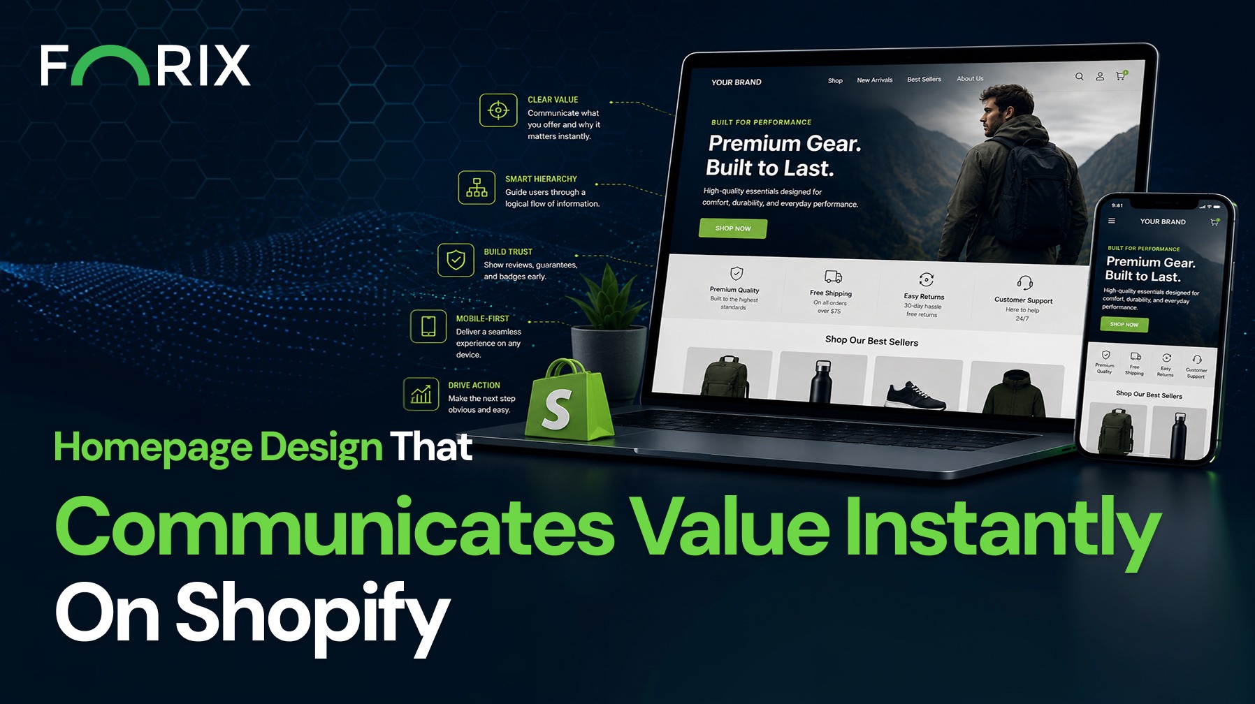
For Shopify retailers, your homepage has one job: communicate why your brand matters immediately.
Shoppers don’t arrive ready to explore. They arrive ready to evaluate. Within a few seconds, they decide whether your store is relevant, trustworthy, and worth their time. If your value proposition isn’t clear, they move on. A high-performing homepage isn’t about visual complexity. It’s about clarity, structure, and intentional messaging.
Ready to improve your Shopify homepage performance? Forix’s Design and Strategy services helps retailers create clearer, more conversion-focused eCommerce experiences through strategic design and optimization.
Why Immediate Clarity Matters on Shopify
Shopify makes it easy to launch and scale a storefront, but design alone does not drive conversion. What matters is how quickly a visitor understands what you sell, who it’s for, and why it’s different.
When your homepage communicates value clearly:
Bounce rates decrease
Product discovery improves
Conversion paths become shorter
Without that clarity, even well-designed stores struggle to convert.
Start With a Focused Hero Section
Your hero section sets the tone for the entire experience. It should answer three key questions instantly:
What do you sell?
Who is it for?
Why should they care?
Avoid generic messaging like “Premium Quality Products.” Instead, be specific and outcome-driven.
For example:
“Performance skincare designed for sensitive skin”
“Durable workwear built for demanding environments”
Support this with a clean visual and a clear call to action. Avoid overcrowding the hero with multiple competing messages.
Prioritize Message Hierarchy
A strong homepage guides users through a logical flow of information. Shopify themes often provide flexible sections, but structure matters more than flexibility.
Your hierarchy should typically follow:
Value proposition (hero)
Key benefits or differentiators
Featured products or collections
Social proof (reviews, testimonials, press)
Supporting content (brand story, guarantees)
Each section should build confidence and reduce hesitation.
Make Navigation Intuitive and Purposeful
Navigation plays a critical role in how quickly users find what they need. Overcomplicated menus create friction and slow decision-making.
Best practices include:
Keep top-level navigation focused and limited
Use clear, familiar labels (e.g., “Shop,” “New Arrivals,” “Best Sellers”)
Highlight high-intent categories
On Shopify, optimizing navigation structure often leads to measurable improvements in engagement and conversion.
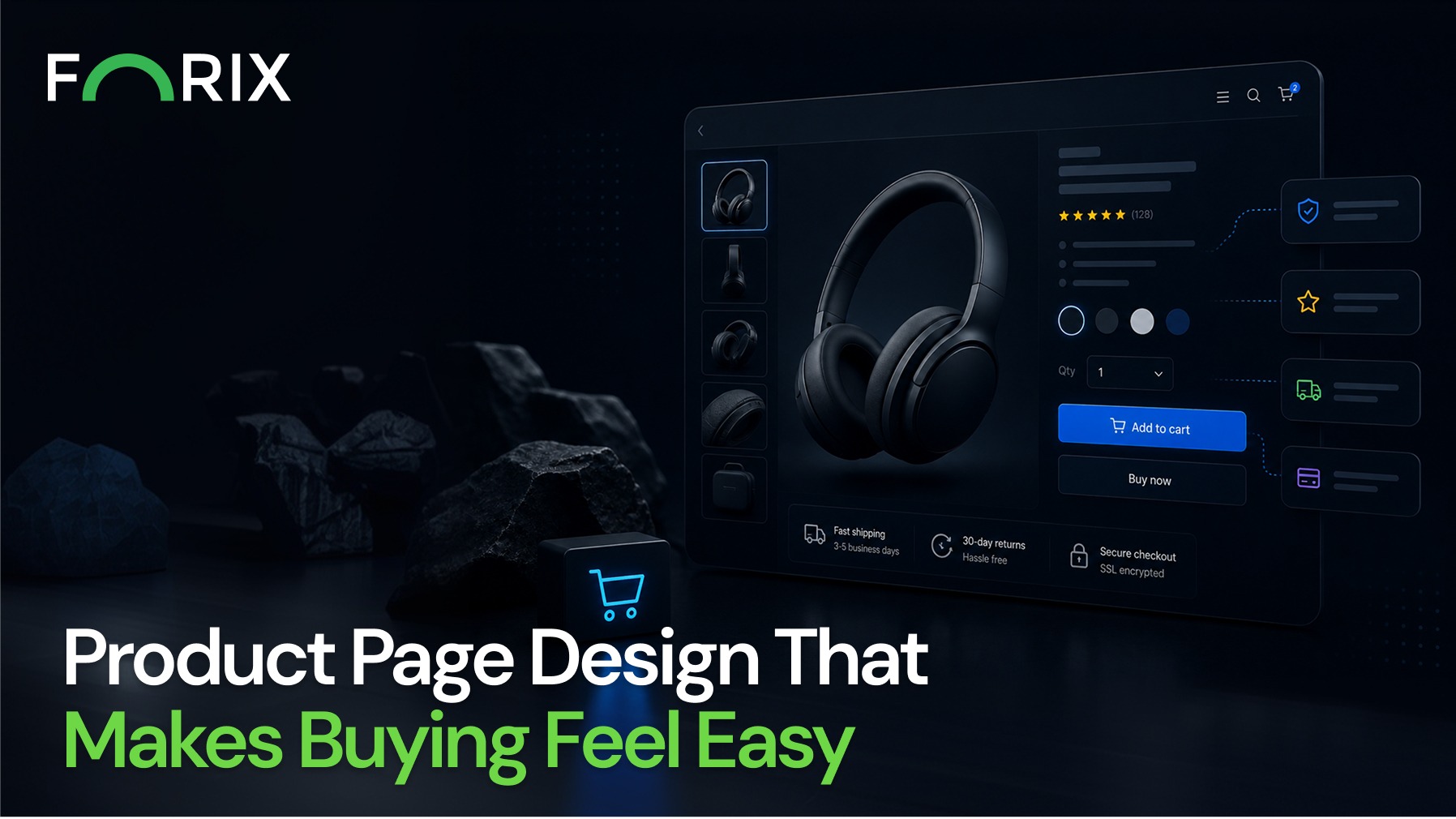
Use Visual Design to Reinforce Value
Design should support your message, not distract from it.
Effective Shopify homepages use:
High-quality imagery that reflects the product in use
Consistent typography for readability
Strategic spacing to reduce cognitive load
Avoid decorative elements that don’t contribute to clarity. Every visual component should help the user understand your brand faster.
Build Trust Early in the Experience
Trust is a key factor in whether a visitor continues browsing or exits.
You can establish credibility quickly by including:
Customer reviews or ratings near the top of the page
Trust badges or guarantees
Recognizable brand partnerships or press mentions
These elements reassure users that your store is legitimate and your products deliver value.
Optimize for Mobile-First Experiences
A significant portion of Shopify traffic comes from mobile devices. Your homepage must communicate value just as effectively on smaller screens.
Focus on:
Concise headlines and shorter sections
Tap-friendly navigation and CTAs
Fast loading times
Mobile users are even less patient than desktop users. Clarity and speed are critical.
Continuously Test and Refine
Homepage design is not a one-time decision. It should evolve based on data.
Key areas to test include:
Headline variations in the hero section
Placement of CTAs
Order of homepage sections
Visual vs. text-heavy approaches
At Forix, we often see significant performance gains from small refinements that improve clarity and reduce friction.
Common Mistakes to Avoid
Many Shopify stores struggle with homepage performance due to avoidable issues:
Vague or generic messaging
Too many competing calls to action
Overloaded layouts with no clear hierarchy
Lack of trust signals
These issues dilute your value proposition and make it harder for users to take the next step.
Conclusion
Your homepage is your first and often only chance to communicate value.
For Shopify brands, the most effective designs are not the most complex. They are the most clear, focused, and aligned with user intent.
Forix helps eCommerce brands design and optimize Shopify experiences that convert by making value immediately visible. With the right structure, messaging, and ongoing refinement, your homepage can become a powerful driver of growth.
If your homepage isn’t clearly communicating why customers should choose you, it’s time to rethink the experience.
From flat sales to explosive sales growth - here's what happens when you partner with Forix
Partnering with Forix was hands down the best decision I’ve made for my store. The
redesign completely
transformed my site — it looks like a million dollars, yet I paid only a fraction of
what I expected.
Even better, sales started climbing almost immediately. Their process was simple,
transparent, and
focused on results. I only wish I had done it sooner.
Sarah Mitchell,Owner
“The free website report from Forix opened our eyes to issues we didn’t even know were costing us sales. The recommendations were clear, actionable, and backed by data. After implementing just a few of their suggestions, we saw a noticeable lift in conversions within weeks. Forix didn’t just give us a report—they gave us a roadmap to growth.”
Lena Hoffman, Director of eCommerce
“The redesign was exactly what my business needed. Clean, mobile-friendly, and conversion-focused. Sales are up 35% since launch.”
Ethan Carter, Founder
“Forix made our Magento to Shopify migration completely stress-free. Every product, customer record, and integration was moved accurately, and the new store’s design is sleek and user-friendly. Our team can now focus on growing sales instead of worrying about technical issues.”
Emily Rivera, Head of Digital Operations
198%
Conversion increase
32%
Transaction increase
30%
Time on site increase
28%
Conversion increase
92%
Revenue increase
87%
Engagement increase
Ready to See the Difference?
Your next big sales boost could start with our free website report. Let us show you the
untapped
potential in your store.
Complete the form below and our team will reach out to get started.
Thank you!
We’ve received your request for a free website report. Our team will be in touch shortly to gather a few details so we can begin your site analysis.
Click Here To
Get My Free Website Report Now
Claim Your FREE Webpage Design and Sell More ASAP
Complete the form below and our team will reach out to get started.
Thank you!
We’ve received your request for a free webpage design. Our team will be in touch shortly to gather a few details so we can begin your page redesign.
Click Here To
Get My Free Webpage Design Now
Claim Your FREE Migration Assessment and Sell More ASAP
Complete the form below and our team will reach out to get started.
Thank you!
We’ve received your request for a free Magento-to-Shopify migration assessment. Our team will be in touch shortly to gather a few details so we can begin building your comprehensive migration plan.
Click Here To
Get My Free Migration Assessment Now
Claim Your FREE Site Report and Sell More ASAP (a $2,000 value).
Complete the form below and our team will reach out to get started.
Thank you!
We’ve received your request for a free website report. Our team will be in touch shortly to gather a few details so we can begin your site analysis.