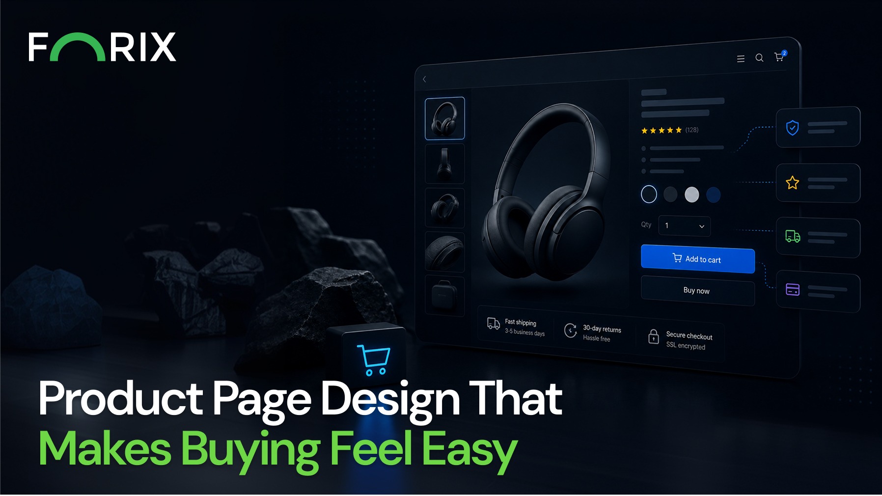
For Shopify retailers, the product page is where decisions happen. Shoppers arrive with interest, but not always with confidence. The role of your product page is to remove doubt, answer questions, and make the purchase feel simple and natural. When this experience is smooth, conversions increase. When it is not, even strong traffic fails to deliver results.
Effective product page design is not about adding more elements. It is about guiding users clearly toward a confident decision.
Shopify provides flexible tools for merchandising, but performance depends on how information is structured and presented.
When a product page feels easy to navigate and understand:
Users spend more time engaging with the product
Friction during decision making decreases
Conversion rates improve
If shoppers need to search for key details or feel uncertain, they are more likely to leave without purchasing.
Make the Value Proposition Immediate
The top section of your product page should communicate value instantly.
This includes:
A clear product title
A concise description of what makes the product unique
Pricing and availability displayed prominently
Avoid vague language. Instead, focus on outcomes and benefits.
For example, rather than listing features alone, connect them to real use cases. Show how the product solves a problem or improves the customer’s experience.
Use Images That Support Decision Making
Visual content is one of the most important elements on a Shopify product page.
Strong product imagery should:
Show the product from multiple angles
Include lifestyle images that demonstrate real use
Provide zoom functionality for detail
If relevant, include short videos to highlight features or usage. Visual clarity reduces uncertainty and helps customers feel confident in their purchase.
Keep the Path to Purchase Clear
The add to cart process should feel simple and direct.
Best practices include:
Place the add to cart button in a highly visible position
Use clear and action oriented language
Minimize distractions around the purchase area
Avoid placing unnecessary elements near the primary call to action. Every additional step or competing message increases friction.
Structure Information for Easy Scanning
Most users do not read product pages line by line. They scan for key information.
Organize content using:
Bullet points for features and benefits
Short paragraphs for descriptions
Tabs or accordions for detailed information
Include essential details such as sizing, materials, shipping, and returns in a structured format. This reduces the need for users to search elsewhere.
Build Trust at the Right Moment
Trust signals are critical on product pages.
You can strengthen confidence by including:
Customer reviews and ratings
User generated content or testimonials
Clear return and shipping policies
Position these elements close to the purchase area so they support decision making at the right time.
Optimize for Mobile Shopping
A large share of Shopify traffic comes from mobile users. Your product page must perform equally well on smaller screens.
Focus on:
Clear and concise content
Sticky add to cart buttons for easy access
Fast loading images and pages
Mobile users expect a seamless experience. Any friction can quickly lead to abandonment.
Reduce Cognitive Load
Too many choices or too much information can overwhelm shoppers.
Simplify the experience by:
Limiting unnecessary options
Using default selections where appropriate
Highlighting best selling or recommended options
A focused experience helps users make decisions faster and with more confidence.
Test and Refine Continuously
Product page performance should be guided by data, not assumptions.
Key areas to test include:
Product descriptions and headlines
Image types and layouts
Placement of trust signals
Variations of the add to cart button
At Forix, small, targeted improvements often lead to meaningful gains in conversion and average order value.
Common Mistakes to Avoid
Many Shopify stores struggle with product page performance due to avoidable issues:
Overloading the page with excessive content
Hiding key information below the fold
Weak or unclear value propositions
Lack of trust building elements
Addressing these issues can significantly improve the buying experience.
Conclusion
A high performing product page makes buying feel easy.
For Shopify brands, success comes from clarity, structure, and a deep understanding of how users make decisions. When your product page removes friction and builds confidence, it becomes a powerful driver of growth.
Forix helps eCommerce brands optimize Shopify product pages through data driven design and ongoing refinement. The result is a smoother customer experience and stronger conversion performance.
If your product pages are not converting as expected, it may be time to simplify and realign the experience.
From flat sales to explosive sales growth - here's what happens when you partner with Forix
Partnering with Forix was hands down the best decision I’ve made for my store. The
redesign completely
transformed my site — it looks like a million dollars, yet I paid only a fraction of
what I expected.
Even better, sales started climbing almost immediately. Their process was simple,
transparent, and
focused on results. I only wish I had done it sooner.
Sarah Mitchell,Owner
“The free website report from Forix opened our eyes to issues we didn’t even know were costing us sales. The recommendations were clear, actionable, and backed by data. After implementing just a few of their suggestions, we saw a noticeable lift in conversions within weeks. Forix didn’t just give us a report—they gave us a roadmap to growth.”
Lena Hoffman, Director of eCommerce
“The redesign was exactly what my business needed. Clean, mobile-friendly, and conversion-focused. Sales are up 35% since launch.”
Ethan Carter, Founder
“Forix made our Magento to Shopify migration completely stress-free. Every product, customer record, and integration was moved accurately, and the new store’s design is sleek and user-friendly. Our team can now focus on growing sales instead of worrying about technical issues.”
Emily Rivera, Head of Digital Operations
198%
Conversion increase
32%
Transaction increase
30%
Time on site increase
28%
Conversion increase
92%
Revenue increase
87%
Engagement increase
Ready to See the Difference?
Your next big sales boost could start with our free website report. Let us show you the
untapped
potential in your store.
Complete the form below and our team will reach out to get started.
Thank you!
We’ve received your request for a free website report. Our team will be in touch shortly to gather a few details so we can begin your site analysis.
Click Here To
Get My Free Website Report Now
Claim Your FREE Webpage Design and Sell More ASAP
Complete the form below and our team will reach out to get started.
Thank you!
We’ve received your request for a free webpage design. Our team will be in touch shortly to gather a few details so we can begin your page redesign.
Click Here To
Get My Free Webpage Design Now
Claim Your FREE Migration Assessment and Sell More ASAP
Complete the form below and our team will reach out to get started.
Thank you!
We’ve received your request for a free Magento-to-Shopify migration assessment. Our team will be in touch shortly to gather a few details so we can begin building your comprehensive migration plan.
Click Here To
Get My Free Migration Assessment Now
Claim Your FREE Site Report and Sell More ASAP (a $2,000 value).
Complete the form below and our team will reach out to get started.
Thank you!
We’ve received your request for a free website report. Our team will be in touch shortly to gather a few details so we can begin your site analysis.