Shopify product cards are often treated as simple links to product pages. Before opening a product page, customers use cards to compare price, appearance, ratings, variants, availability, and other signals that determine which products deserve closer attention.
When cards present inconsistent or incomplete information, comparison becomes harder. Shoppers must open several pages, remember details, and repeatedly return to the collection. A clearer product card system reduces that effort and helps customers move toward relevant products more quickly online with more confidence.
Explore how Forix’s Design and Strategy services help Shopify retailers create product discovery experiences that make comparison easier and support stronger shopping decisions.
Start With Consistent Product Imagery
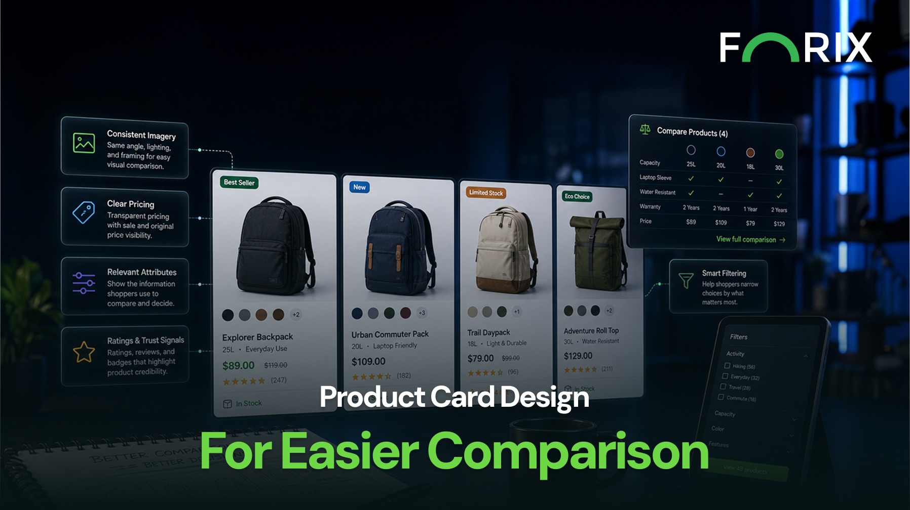
Product images create the first basis for comparison. Cards should use a consistent image ratio, crop, background, and viewing angle whenever the catalog allows it.
Inconsistent imagery can make products appear larger, smaller, darker, or less premium than they are. Consistent presentation helps shoppers focus on meaningful differences rather than adjusting to a new image style in every card.
Secondary images can add context by showing another angle, an in-use view, or a material detail. They should not introduce a completely different composition that makes comparison more difficult.
Prioritize Decision-Making Information
A card cannot display every product-page detail. It should surface the information shoppers use most often to narrow their choices.
Depending on the category, that may include:
Product name and type.
Current price and original price.
Ratings and review count.
Available colors, sizes, or configurations.
Stock status or delivery information.
One clear differentiating attribute.
The right details vary by catalog. Apparel shoppers may need color and size availability, while electronics shoppers may compare capacity or compatibility. Retailers can identify important attributes through site search, filters, customer questions, and product-page behavior.
Make Pricing Easy to Interpret
Pricing should be clear and consistent across every card. Shoppers need to understand whether a product has a fixed price, a price range, a sale price, or a starting price based on configuration.
Too many crossed-out prices, percentage badges, and promotional messages can make the grid difficult to scan. Retailers should also avoid false expectations. If the displayed price applies only to the least expensive variant, the card should communicate that clearly.
Use Badges and Variants Selectively
Badges such as Best Seller, New, or Limited Stock can help shoppers interpret a large collection. Their value decreases when too many products carry them or several badges compete on one card.
Each badge should communicate a meaningful distinction and use consistent styling.
Color swatches, size indicators, and configuration options can also support comparison. However, showing every variant creates clutter. A practical approach is to display a limited number of useful options and indicate when more are available.
When variant selection is supported on the card, the image, price, and availability should update consistently.
Design for Mobile Comparison
On mobile, shoppers see fewer products at once and have less room for supporting information. Cards should preserve the highest-value comparison signals without becoming excessively tall.
Product names should remain readable, prices should not wrap unpredictably, and touch targets should be easy to use. Important information should not depend only on hover behavior.
Retailers should test one-column and two-column layouts with realistic names, sale prices, badges, ratings, and swatches. A design that works with ideal sample content may fail when real catalog data is introduced.
Measure Whether Cards Help Shoppers Progress
Product card improvements should be evaluated through behavior, not visual preference alone. Useful metrics include product click-through rate, collection-page add-to-cart activity, exits, and the time required to reach a relevant product.
Teams can compare performance by device, category, and card feature. Swatches may help in one collection, while technical attributes matter more in another. Testing should determine which information reduces effort for each audience.
Conclusion
Well-designed Shopify product cards make comparison faster and less demanding. Consistent imagery, clear pricing, relevant attributes, restrained badges, and usable variant options help shoppers understand meaningful differences before opening a product page.
Forix helps Shopify retailers design product discovery systems around real shopper behavior and catalog requirements. Stronger product cards do more than create a cleaner grid. We help customers evaluate options and move toward purchase with greater confidence.
What information should a Shopify product card display?
A product card should display the information shoppers need to compare options, such as the product name, price, imagery, ratings, availability, variants, and one or two important differentiating attributes.
How many product variants should appear on a card?
Retailers should display enough variants to communicate available choices without overcrowding the card. A limited number of swatches or options can be shown alongside an indicator that more are available.
Should Shopify product cards include an add-to-cart button?
An add-to-cart button can be useful for simple products that require little additional evaluation. Products with complex configurations may need to direct shoppers to the product page before they can make an accurate selection.
How should sale pricing appear on product cards?
Sale pricing should clearly distinguish the current price from the original price. Retailers should avoid combining too many promotional labels, discount percentages, and badges that make pricing difficult to interpret.
How can retailers measure product card performance?
Retailers can monitor product click-through rates, collection-page add-to-cart activity, collection exits, time to reach a product, and performance differences by device, category, or card feature.
From flat sales to explosive sales growth - here's what happens when you partner with Forix
Partnering with Forix was hands down the best decision I’ve made for my store. The
redesign completely
transformed my site — it looks like a million dollars, yet I paid only a fraction of
what I expected.
Even better, sales started climbing almost immediately. Their process was simple,
transparent, and
focused on results. I only wish I had done it sooner.
Sarah Mitchell,Owner
“The free website report from Forix opened our eyes to issues we didn’t even know were costing us sales. The recommendations were clear, actionable, and backed by data. After implementing just a few of their suggestions, we saw a noticeable lift in conversions within weeks. Forix didn’t just give us a report—they gave us a roadmap to growth.”
Lena Hoffman, Director of eCommerce
“The redesign was exactly what my business needed. Clean, mobile-friendly, and conversion-focused. Sales are up 35% since launch.”
Ethan Carter, Founder
“Forix made our Magento to Shopify migration completely stress-free. Every product, customer record, and integration was moved accurately, and the new store’s design is sleek and user-friendly. Our team can now focus on growing sales instead of worrying about technical issues.”
Emily Rivera, Head of Digital Operations
198%
Conversion increase
32%
Transaction increase
30%
Time on site increase
28%
Conversion increase
92%
Revenue increase
87%
Engagement increase
Ready to See the Difference?
Your next big sales boost could start with our free website report. Let us show you the
untapped
potential in your store.
Complete the form below and our team will reach out to get started.
Thank you!
We’ve received your request for a free website report. Our team will be in touch shortly to gather a few details so we can begin your site analysis.
Click Here To
Get My Free Website Report Now
Claim Your FREE Webpage Design and Sell More ASAP
Complete the form below and our team will reach out to get started.
Thank you!
We’ve received your request for a free webpage design. Our team will be in touch shortly to gather a few details so we can begin your page redesign.
Click Here To
Get My Free Webpage Design Now
Claim Your FREE Migration Assessment and Sell More ASAP
Complete the form below and our team will reach out to get started.
Thank you!
We’ve received your request for a free Magento-to-Shopify migration assessment. Our team will be in touch shortly to gather a few details so we can begin building your comprehensive migration plan.
Click Here To
Get My Free Migration Assessment Now
Claim Your FREE Site Report and Sell More ASAP (a $2,000 value).
Complete the form below and our team will reach out to get started.
Thank you!
We’ve received your request for a free website report. Our team will be in touch shortly to gather a few details so we can begin your site analysis.