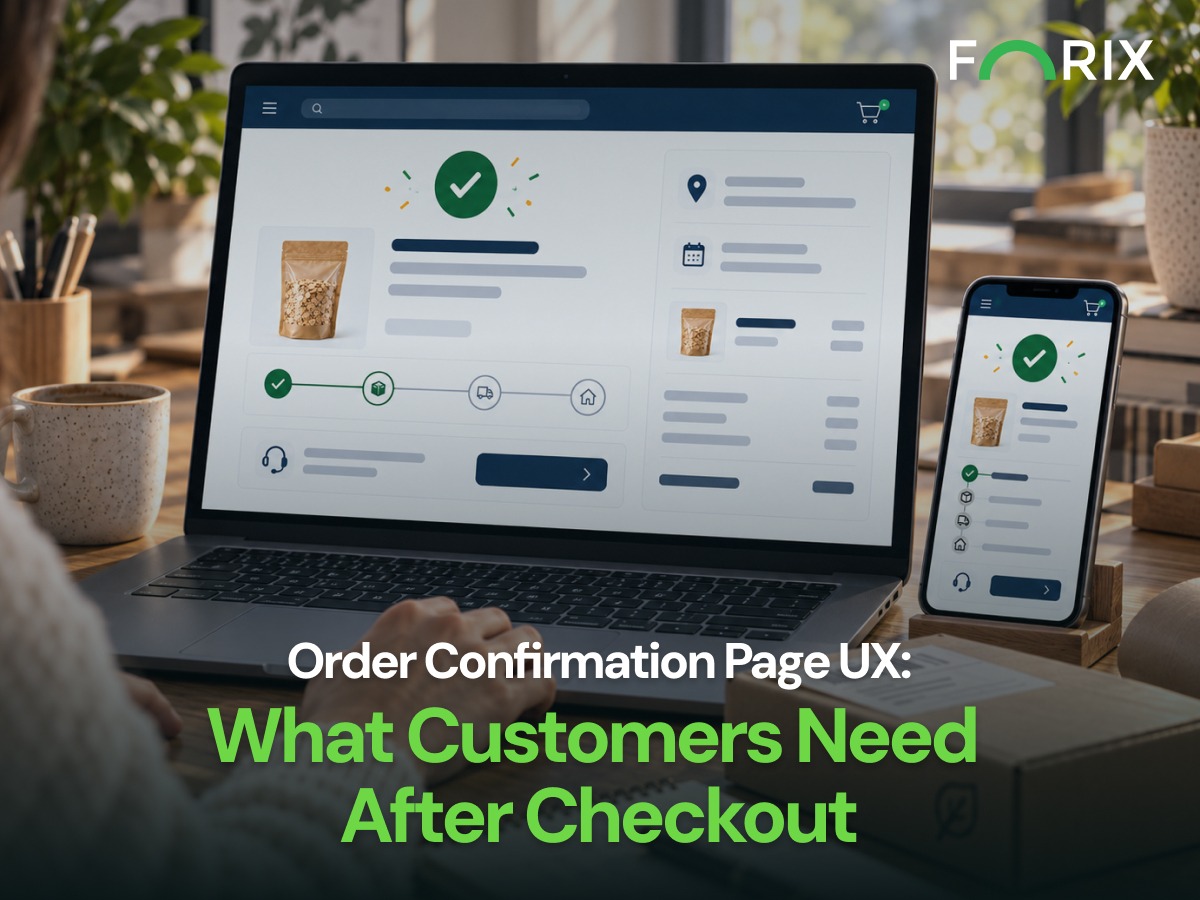
Checkout may be complete, but customers can still have questions. They want to know if the order went through, if the details are correct, and what happens next.
For Shopify retailers, the confirmation page should answer those questions fast. It should reassure the customer before it introduces account prompts, loyalty messages, or product recommendations.
First, make the result clear. A heading such as “Thank you. Your order is confirmed.” works better than a generic thank-you message.
Customers should also find the confirmation number right away. The top of the page should answer two questions:
Did my order go through?
What is my confirmation number?
Clear confirmation can reduce repeat actions and support questions. Customers should not need to wonder if they must submit the order again.
Design Around Shopify’s Post-Checkout Flow
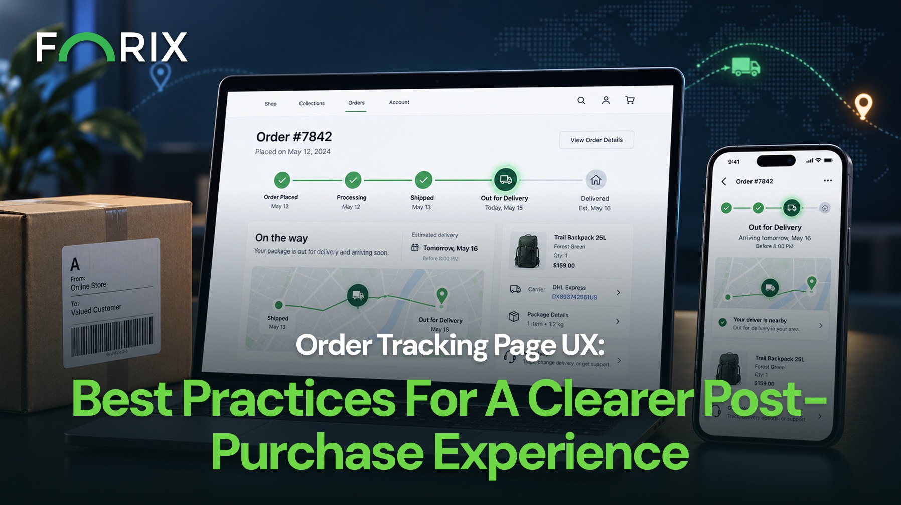
For Shopify retailers, the confirmation page should point customers to future updates. These may appear in email, their account, or the order status page.
That handoff matters. The page should explain what customers can check now and where they should look later for processing, shipping, or delivery updates.
As a result, customers know where to go next instead of returning to the confirmation page for answers.
Keep the same terms across the Shopify confirmation page, email, account, and order status experience. Customers should not have to learn new labels for the same order stage.
Let Customers Verify the Order
Next, help customers check what they submitted.
A clear order summary may include:
Products and quantities
Shipping information
Billing information
Payment summary
Delivery or pickup method
Contact information
Confirmation number
The details should be easy to scan on desktop and mobile. A clear layout also helps customers spot a wrong address, quantity, or contact detail before they leave the page.
Set Expectations Before Customers Leave
After the order is confirmed, explain what happens next.
Customers may need to know:
When the confirmation email should arrive
Whether processing starts right away
When shipping or pickup details will appear
Where future order updates will be shown
Whether special orders may take longer
The page does not need to track the order. Instead, it should explain the next step and where future updates will appear.
Make Help Easy to Find
Customers may notice a wrong address, quantity, or contact detail soon after placing an order.
Provide a clear path to support or order management. For example, show customers where to request an address change, update an order, or ask about cancellation.
Do not make them search through policy pages to find help.
For Shopify brands, this support path should be easy to find without taking attention away from the order details.
Keep Secondary Actions Secondary
Shopify’s post-checkout experience may also include optional next steps. However, those actions should come after the main order information.
Secondary content may include:
Account access
Product setup or care information
Loyalty program details
Helpful content
Product recommendations
An invitation to keep shopping
These options can support the customer journey. However, they should not compete with the order confirmation, order details, or next-step information.
Measure Post-Purchase Uncertainty
Retailers can learn from what customers do after checkout.
Monitor:
Support contacts after purchase
Questions about whether an order was received
Address or order correction requests
Confirmation email engagement
Clicks to order management
Confirmation-page errors
Mobile usability issues
Duplicate-order behavior
Customer service data can add context. Repeated questions often show where the page needs work.
For example, frequent questions about order status may point to weak next-step messaging. A high number of correction requests may show that key order details are hard to review.
These patterns can help Shopify teams improve post-checkout messages, order details, and support paths.
Conclusion
A strong order confirmation page should answer the customer’s main questions first.
Confirm the purchase. Make the order easy to verify. Explain what happens next. Show customers where to get help if something needs to change.
When these priorities are clear, the page creates a smoother handoff from checkout to the next stage of the order.
Forix helps Shopify brands improve the moments that affect conversion, customer confidence, and long-term performance.
An order confirmation page appears immediately after checkout and confirms that the retailer has successfully received the customer’s order.
What should a Shopify order confirmation page show first?
It should first confirm that the transaction succeeded and display the order confirmation number clearly. The order summary and important customer details should follow.
Is an order confirmation page the same as an order tracking page?
No. The confirmation page verifies that an order was successfully placed. Tracking or order-status experiences provide later updates about processing, shipment, and delivery.
Should Shopify retailers include product recommendations on an order confirmation page?
They can, but only after essential confirmation, order details, expectations, and support information are clear. Recommendations should remain relevant and secondary.
How can retailers measure order confirmation page UX?
Useful signals include post-purchase support contacts, order correction requests, confirmation-page errors, order-management clicks, mobile usability problems, and repeated customer questions after checkout.
From flat sales to explosive sales growth - here's what happens when you partner with Forix
Partnering with Forix was hands down the best decision I’ve made for my store. The
redesign completely
transformed my site — it looks like a million dollars, yet I paid only a fraction of
what I expected.
Even better, sales started climbing almost immediately. Their process was simple,
transparent, and
focused on results. I only wish I had done it sooner.
Sarah Mitchell,Owner
“The free website report from Forix opened our eyes to issues we didn’t even know were costing us sales. The recommendations were clear, actionable, and backed by data. After implementing just a few of their suggestions, we saw a noticeable lift in conversions within weeks. Forix didn’t just give us a report—they gave us a roadmap to growth.”
Lena Hoffman, Director of eCommerce
“The redesign was exactly what my business needed. Clean, mobile-friendly, and conversion-focused. Sales are up 35% since launch.”
Ethan Carter, Founder
“Forix made our Magento to Shopify migration completely stress-free. Every product, customer record, and integration was moved accurately, and the new store’s design is sleek and user-friendly. Our team can now focus on growing sales instead of worrying about technical issues.”
Emily Rivera, Head of Digital Operations
198%
Conversion increase
32%
Transaction increase
30%
Time on site increase
28%
Conversion increase
92%
Revenue increase
87%
Engagement increase
Ready to See the Difference?
Your next big sales boost could start with our free website report. Let us show you the
untapped
potential in your store.
Complete the form below and our team will reach out to get started.
Thank you!
We’ve received your request for a free website report. Our team will be in touch shortly to gather a few details so we can begin your site analysis.
Click Here To
Get My Free Website Report Now
Claim Your FREE Webpage Design and Sell More ASAP
Complete the form below and our team will reach out to get started.
Thank you!
We’ve received your request for a free webpage design. Our team will be in touch shortly to gather a few details so we can begin your page redesign.
Click Here To
Get My Free Webpage Design Now
Claim Your FREE Migration Assessment and Sell More ASAP
Complete the form below and our team will reach out to get started.
Thank you!
We’ve received your request for a free Magento-to-Shopify migration assessment. Our team will be in touch shortly to gather a few details so we can begin building your comprehensive migration plan.
Click Here To
Get My Free Migration Assessment Now
Claim Your FREE Site Report and Sell More ASAP (a $2,000 value).
Complete the form below and our team will reach out to get started.
Thank you!
We’ve received your request for a free website report. Our team will be in touch shortly to gather a few details so we can begin your site analysis.